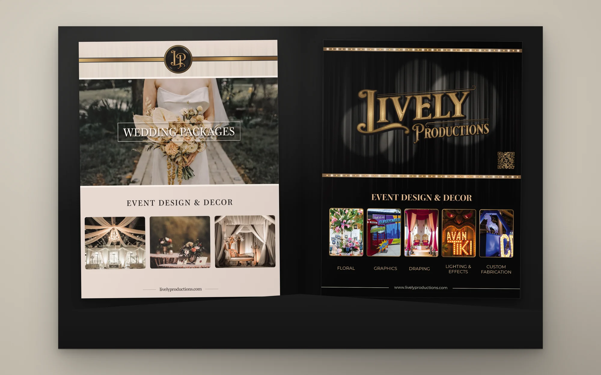
The pitch folder, open to both pages
Lively Productions and Living Lively
Lively Productions runs two businesses. Lively Productions designs and builds events, and Living Lively is its floral and home decor line for weddings and everyday arrangements. I refined the shared logo, wrote the brand guides for both, and applied the system to everything a client sees, from the business cards to the company truck.
Every folder opens to both businesses. The wedding page on the left uses Living Lively's palette, and the event services page on the right uses Lively Productions'. Each page works alone, and the two look related when the folder is open.
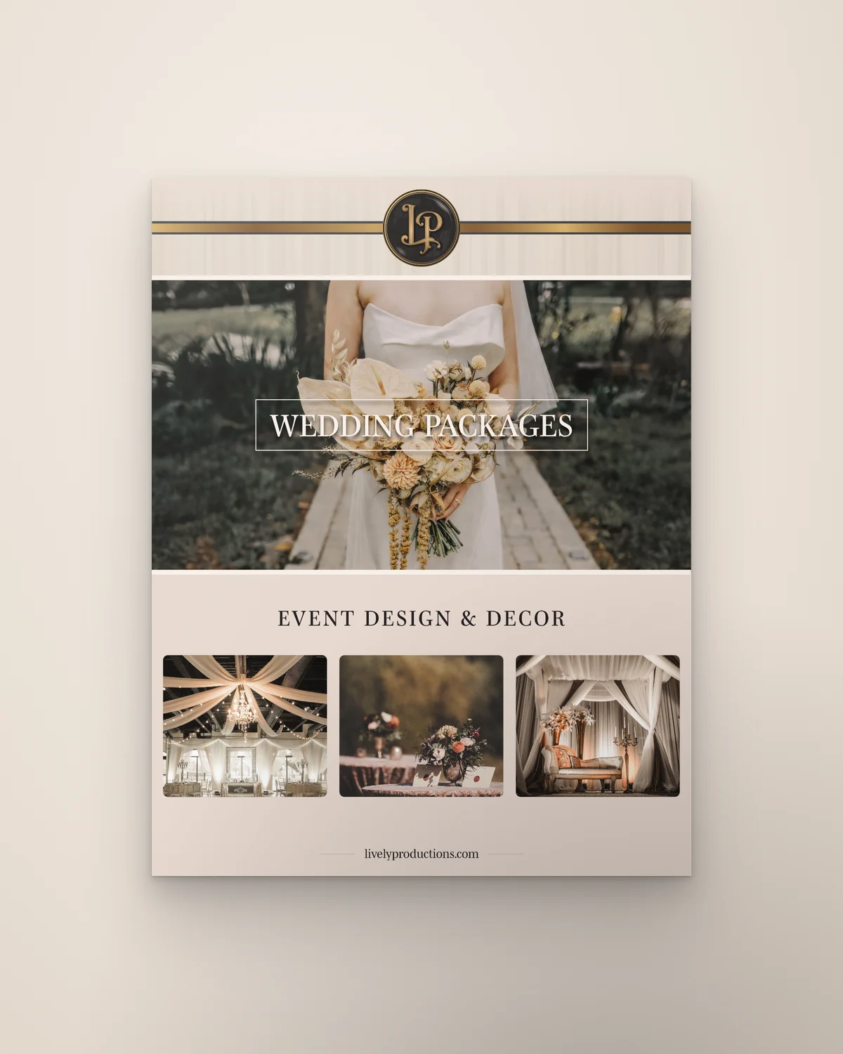 Left: Living Lively
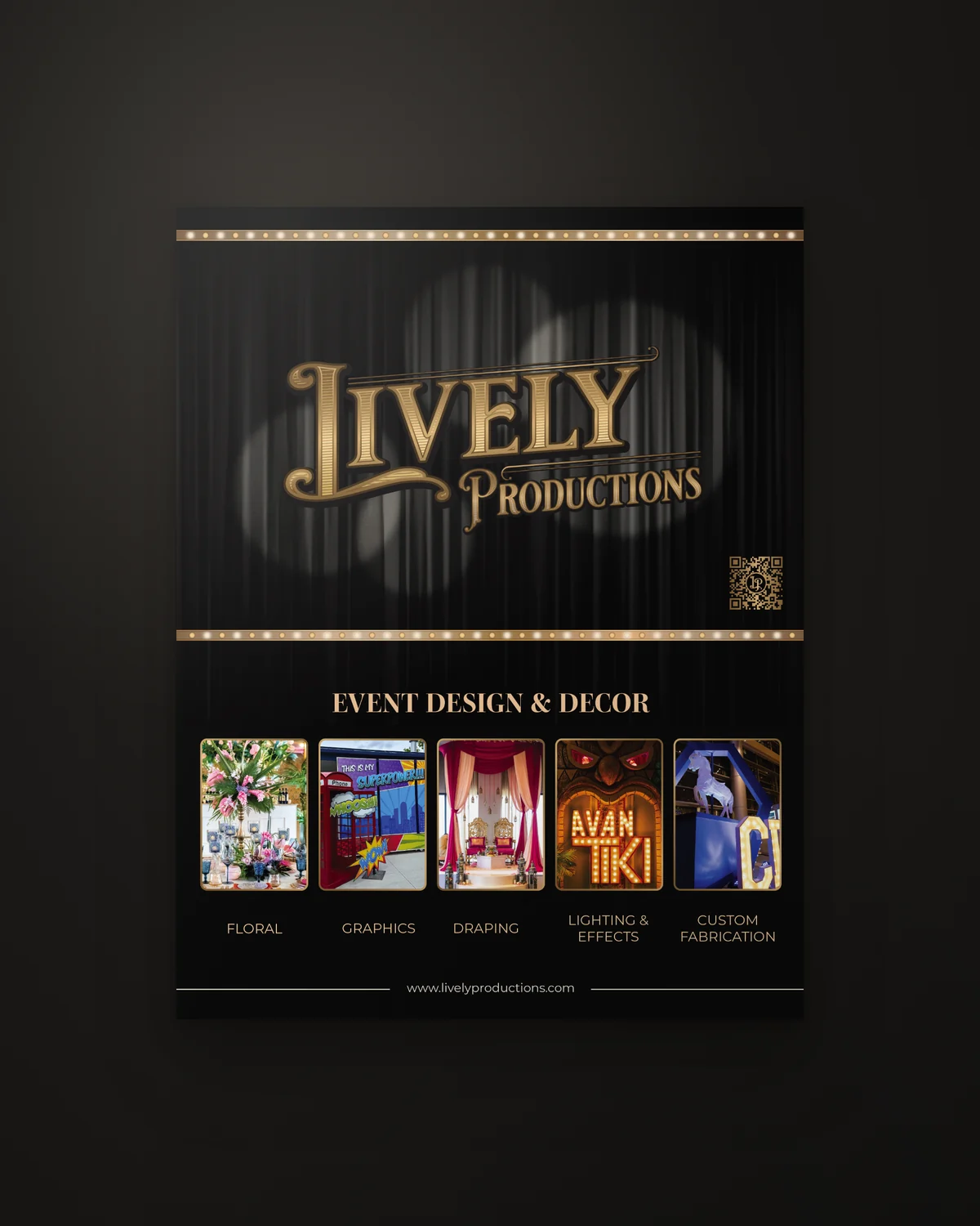 Right: Lively Productions
Cream and blush tones, natural light, and real wedding photography with plenty of open space. It speaks to couples and homeowners planning something personal.
A black stage curtain, warm spotlights, engraved gold lettering, and a row of marquee bulbs. It speaks to planners and companies booking a full production.
 Before
 After
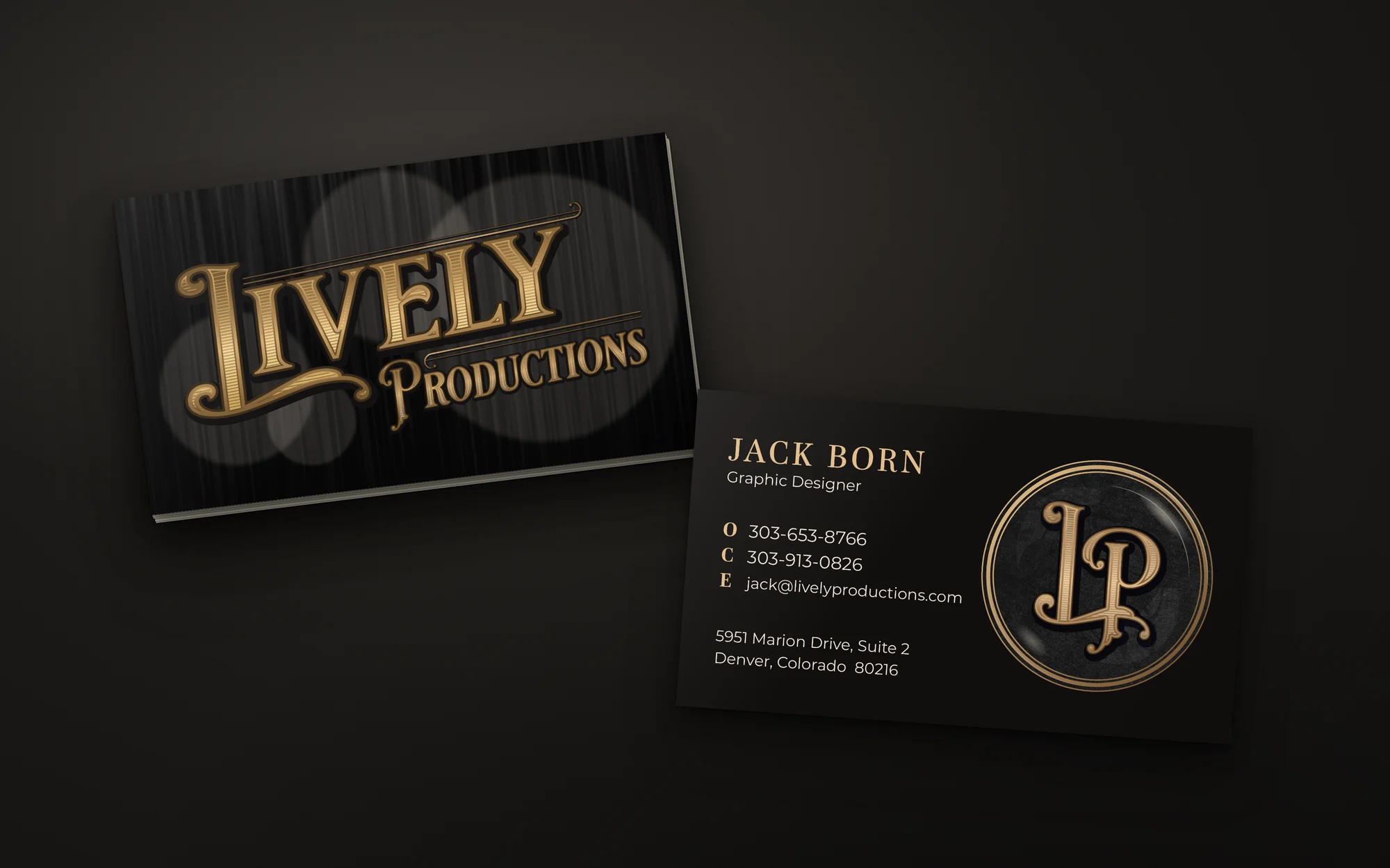 Final card
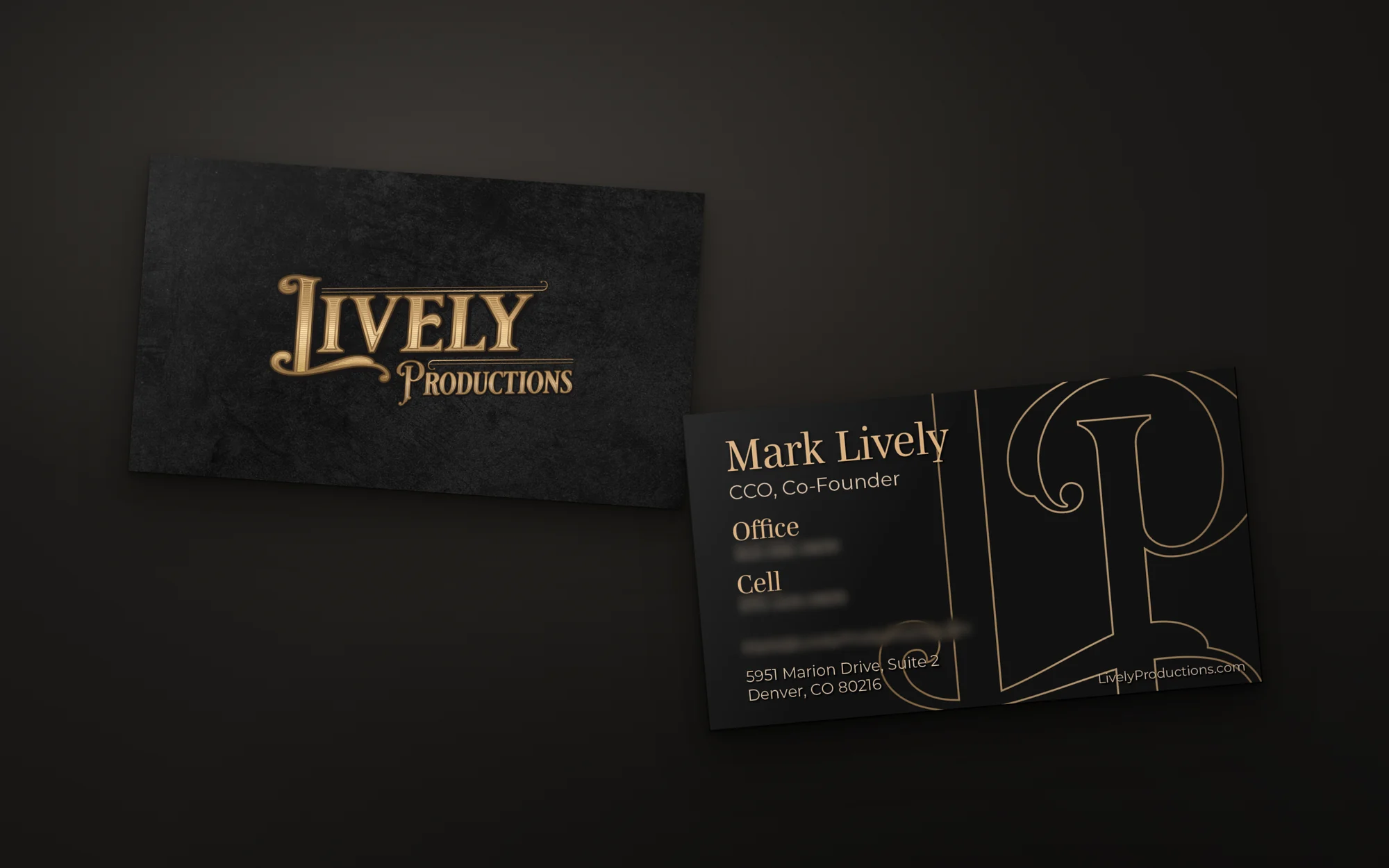 Not produced
The front puts the logo alone on textured black. The back is built around an oversized outline of the LP monogram. I blurred the contact details.
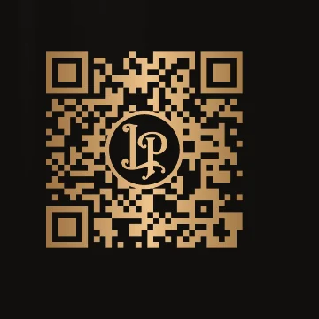
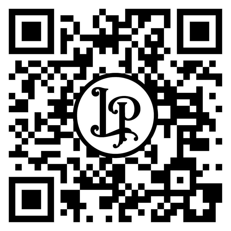 The code
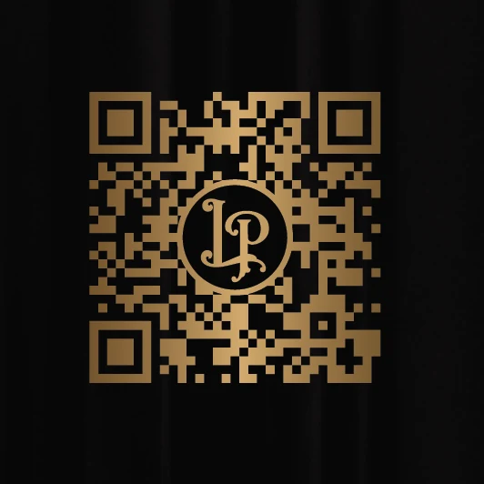 On the folder
 On the truck
The monogram covers the center of the code, and it still scans. It works in black on white and in gold on black, on both the folder and the back of the truck.
The box truck shows up at every load in, so it carries the full Lively Productions look: the curtain, the spotlights, the gold logo, and the list of services. I built the print ready vinyl file for each panel.
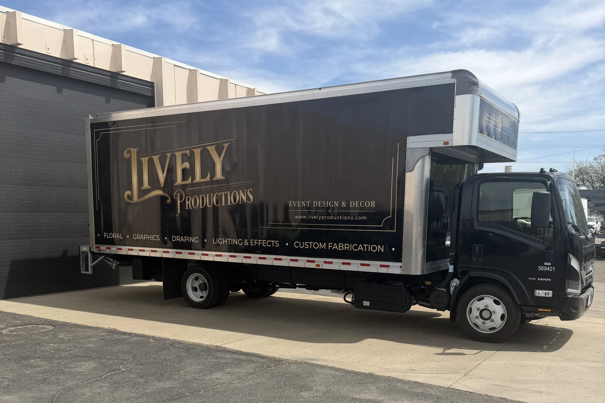 Installed
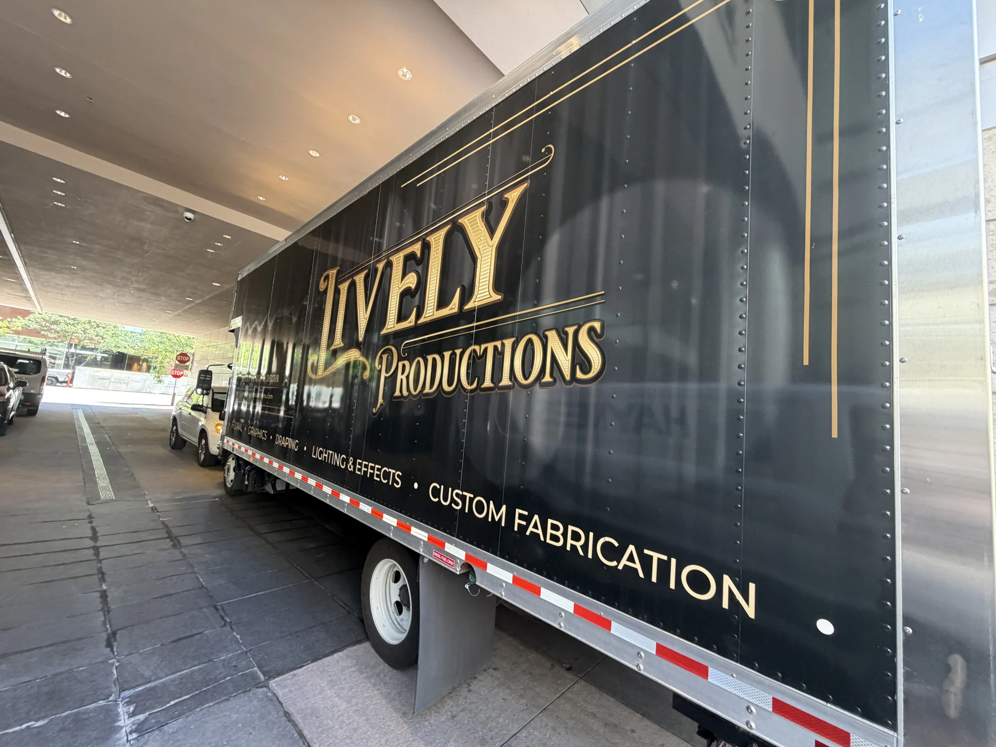 Installed
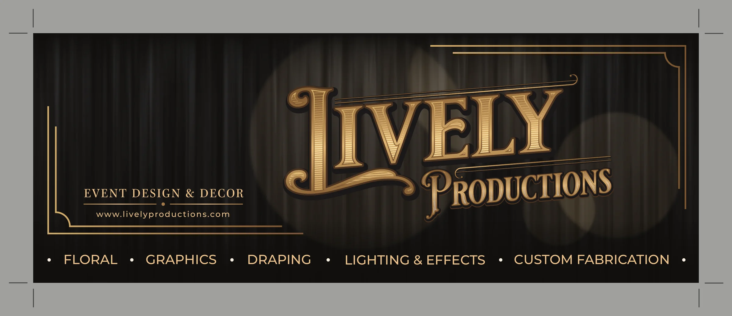 Side panel
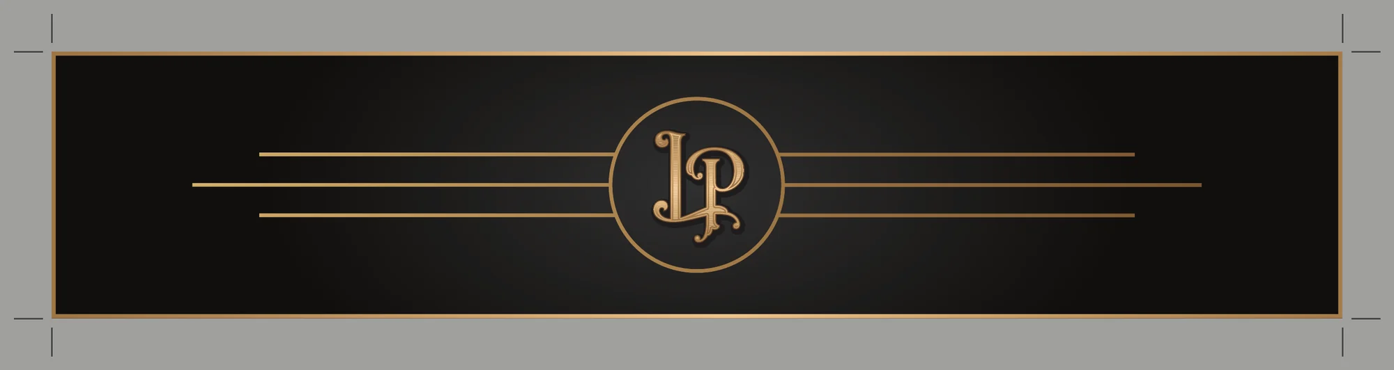 Cab header
The cab header is the narrow panel above the cab, where the box hangs over it. It carries the badge between gold rules, so the truck reads as Lively from the front as well as the sides.
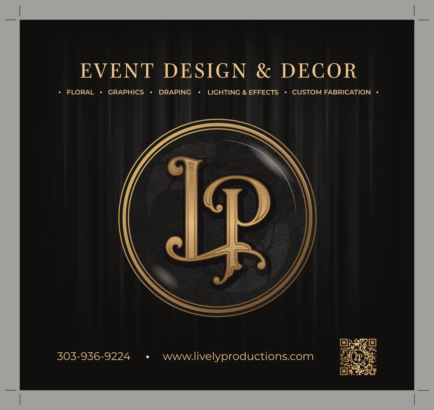 Rear door
The rear door carries the full badge, the phone number, the web address, and the gold QR code, so drivers behind the truck know whose it is and how to reach them.
These posts ran from October through the holidays. I designed every post, edited the photos in Lightroom and Photoshop, and photographed many of the arrangements myself.
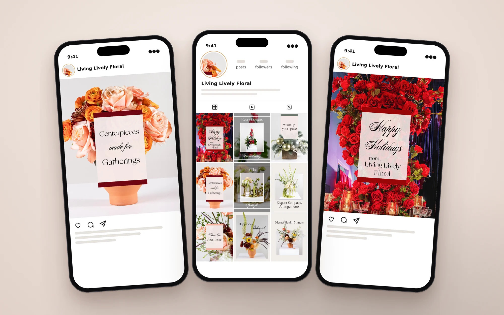
The post layouts use the same elements as the wedding page: a cream card, a serif headline, a script accent, and a color band picked from the flowers in each photo.
brands that share one system and still stand apart
The goal was to keep a growing studio consistent everywhere a client meets it, and to give the floral side a softer look than the production side.
The business cards, the folder, the truck, and the Instagram posts all share the same badge, gold, and layout. Each piece still makes it clear which business you are dealing with.