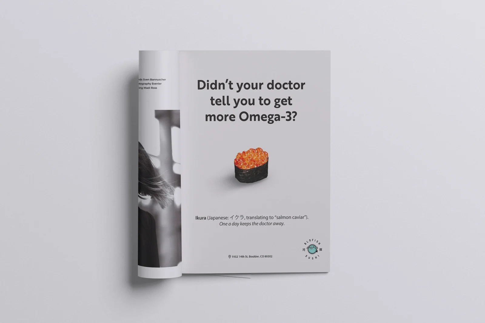
Campaign ad in magazine placement
Brand & Campaign
Blofish Sushi opened as one of the buzziest restaurants in Boulder, with a brand package already built by Fortnight Collective : logo, palette, visual language. My job wasn't to reinvent that. It was to take a static brand kit and turn it into a fall campaign that actually ran, across magazine print, social and discount cards.
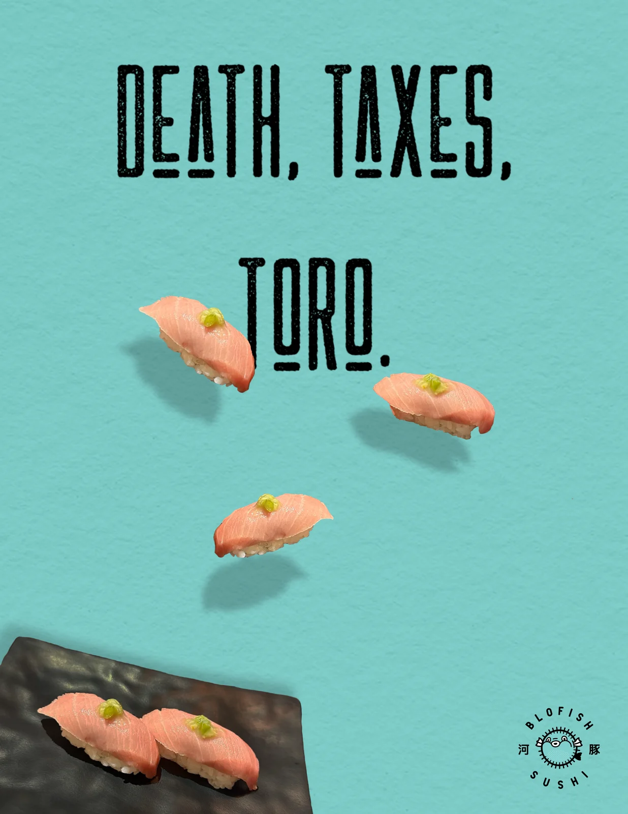
Working inside an established brand package is its own discipline. The interesting decisions move from "what should this look like" to "how far can this stretch and still be unmistakably theirs." Each ad had to do two jobs at once: introduce the restaurant to people who'd never heard of it, and sell a specific dish to people who had.
 01
01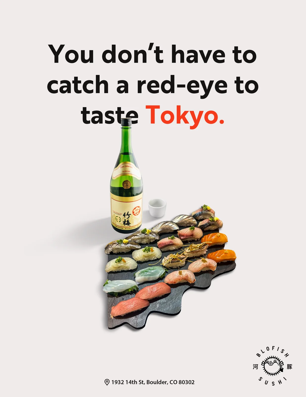 02
02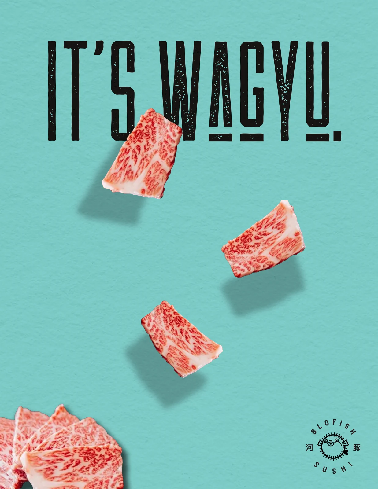 03
03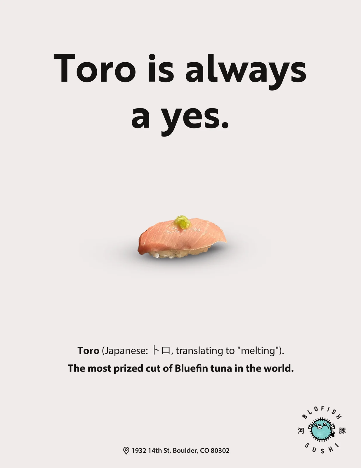 04
04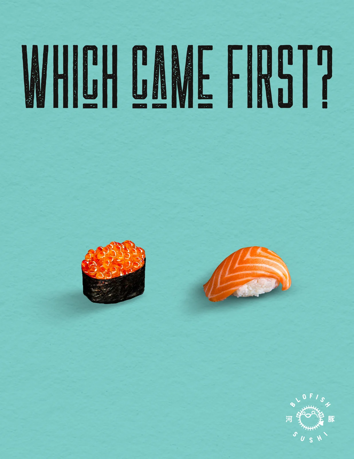 05
05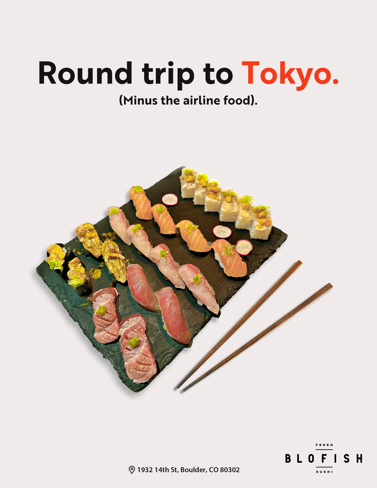 06
06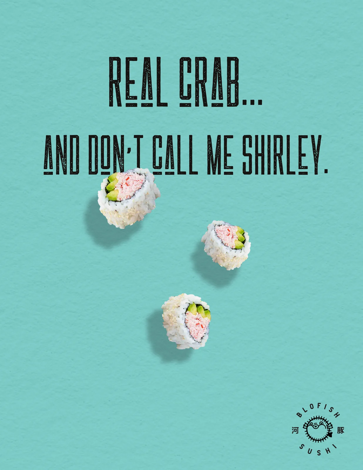 07
07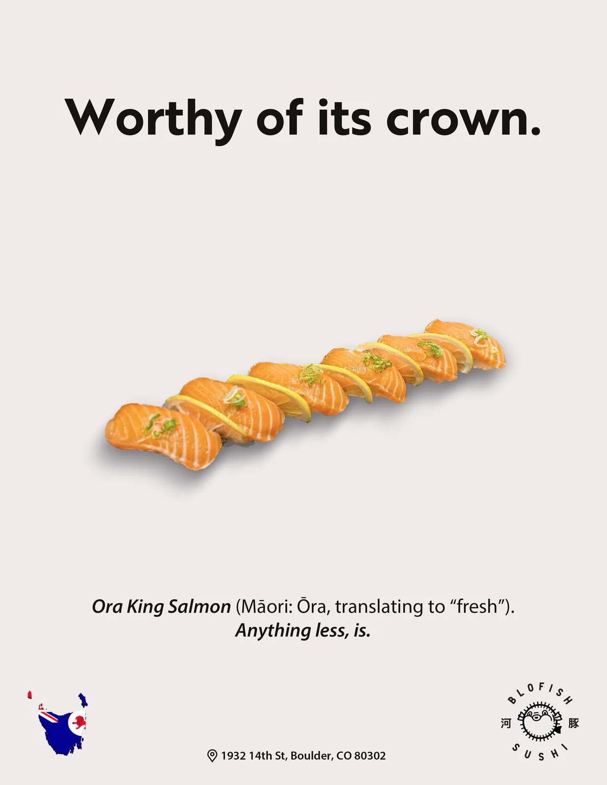 08
08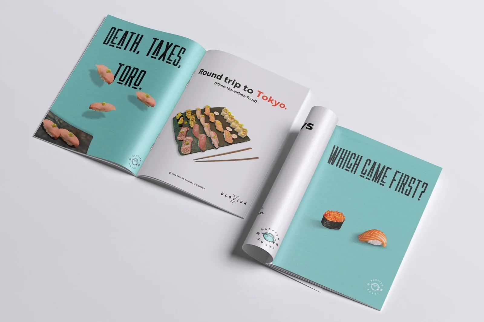 Magazine spreadMagazine spread
A physical piece aimed squarely at students who didn't know the restaurant existed yet. Designed to feel like the brand, and cheap enough to hand out by the hundred.
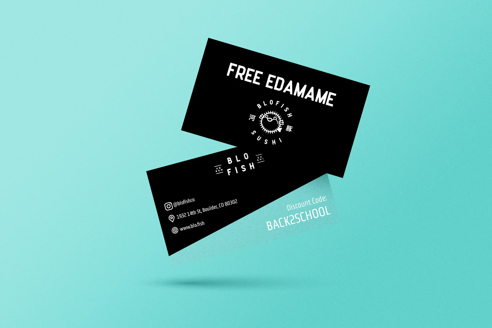 Card design
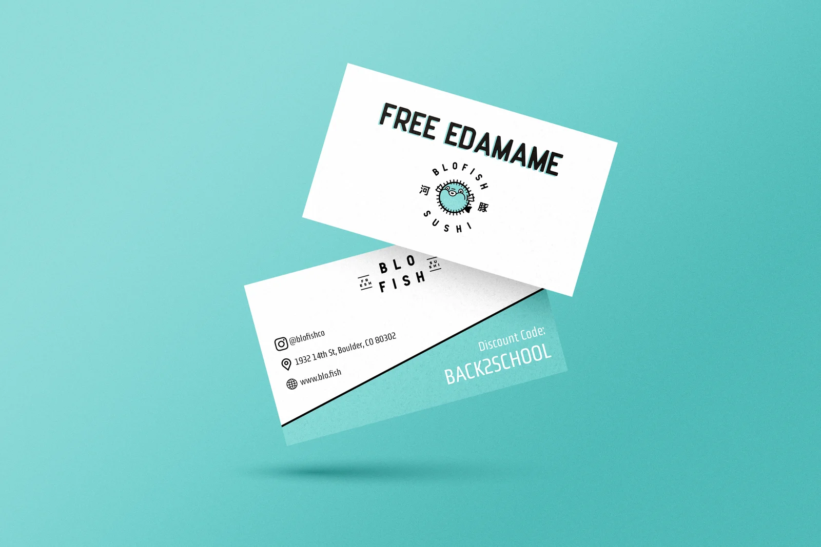 In hand
ads in the core series, plus a card program distributed to hundreds of CU Boulder students
The campaign gave Blofish something the brand package alone couldn't: a repeatable format for showing food. Clean, stylish, and consistent enough that any new dish could drop into the series without a redesign.
The discount cards handled the other half of the problem. Brand awareness is worth less than a reason to walk in, and a card in a student's hand is a reason.