Final crest logo
Brand & Campaign
Champion Catalysts is a fast growing NIL agency that represents female college athletes, helping them build personal brands and turn that into real opportunity. When I joined, the agency was in the middle of pivoting to representing women exclusively and needed an identity and social presence that matched.
My first passes at the logo were what you'd expect from a sports agency: minimal, sleek, athletic. They were fine, and they were wrong. They had none of the character or feminine energy the brand was actually reaching for. Switching the foundation to a script face and giving the crown a delicate outlined stroke instead of a heavy filled one is what finally made it read as this agency and not any agency.
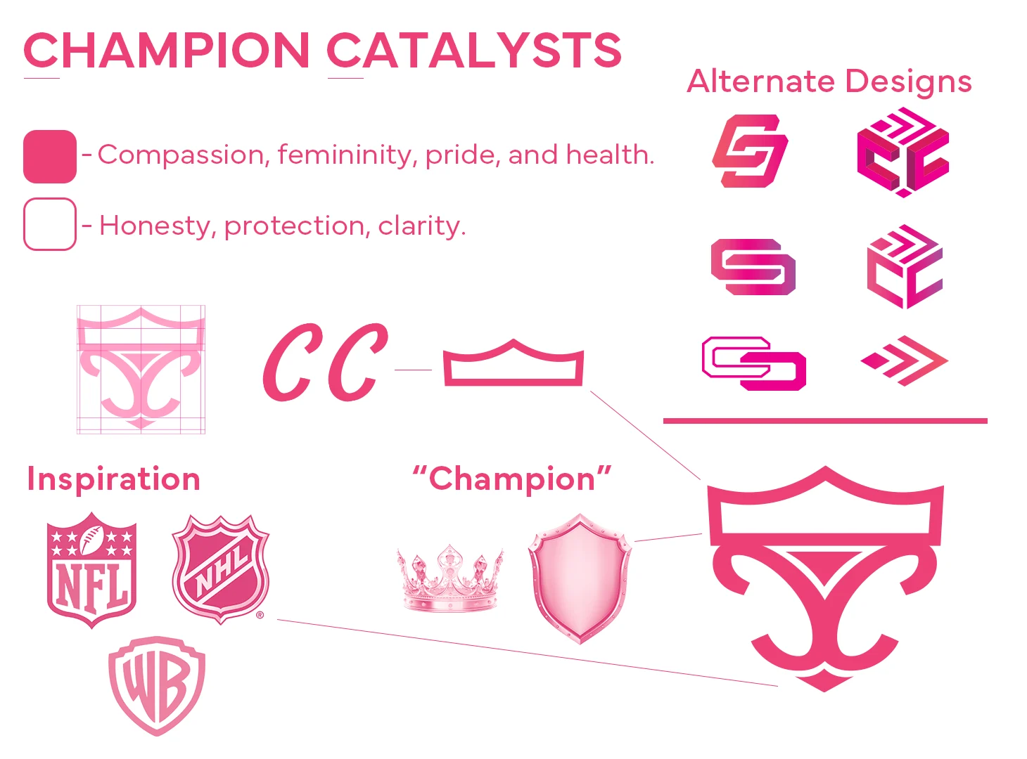 Logo breakdown
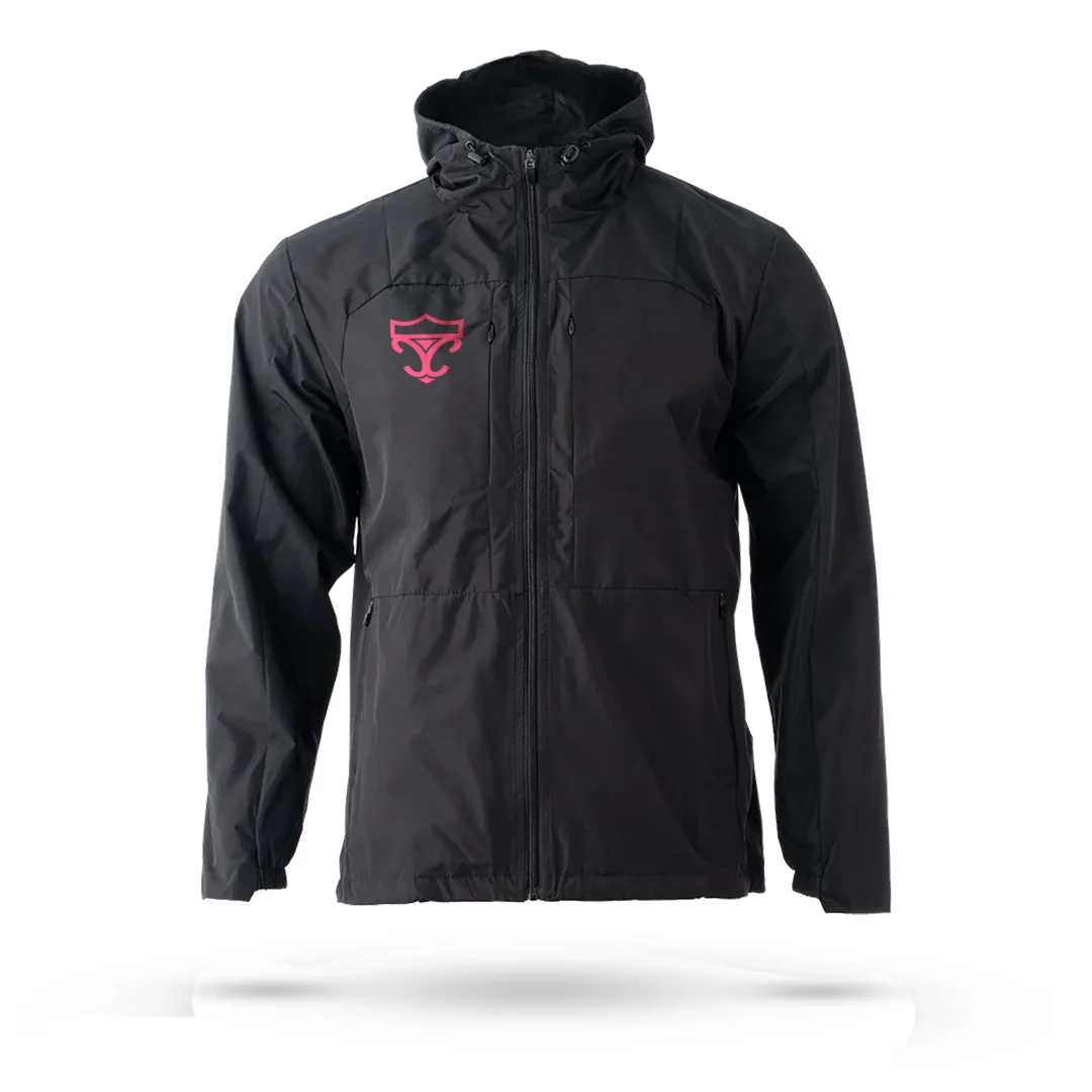 Jacket
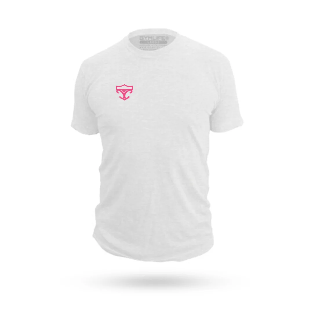 Shirt
Shirt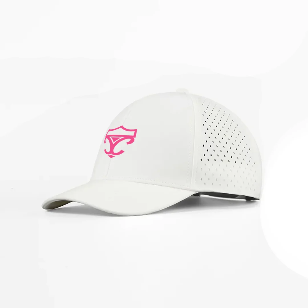 Hat
Hat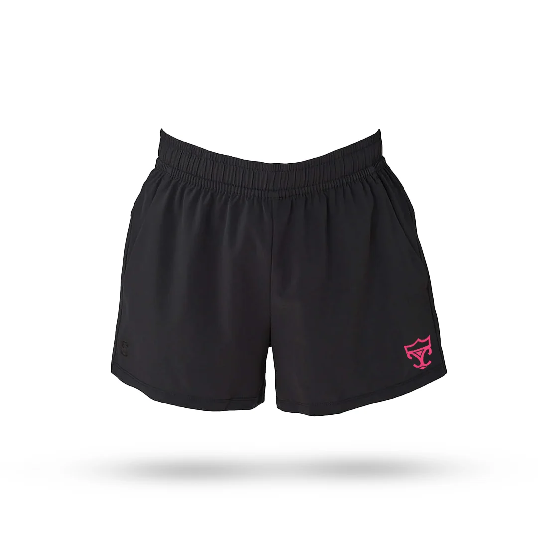 Shorts
We kicked the overhaul off with a post honoring the women who medaled for the U.S.A. at the Olympics. It doubled as the public signal that the agency now represents female athletes exclusively.
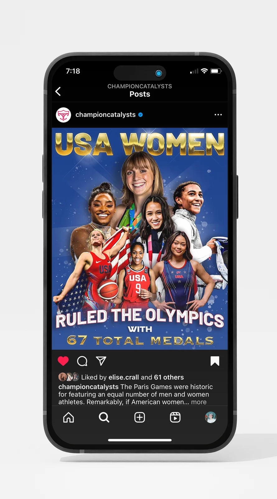 Olympic medalists
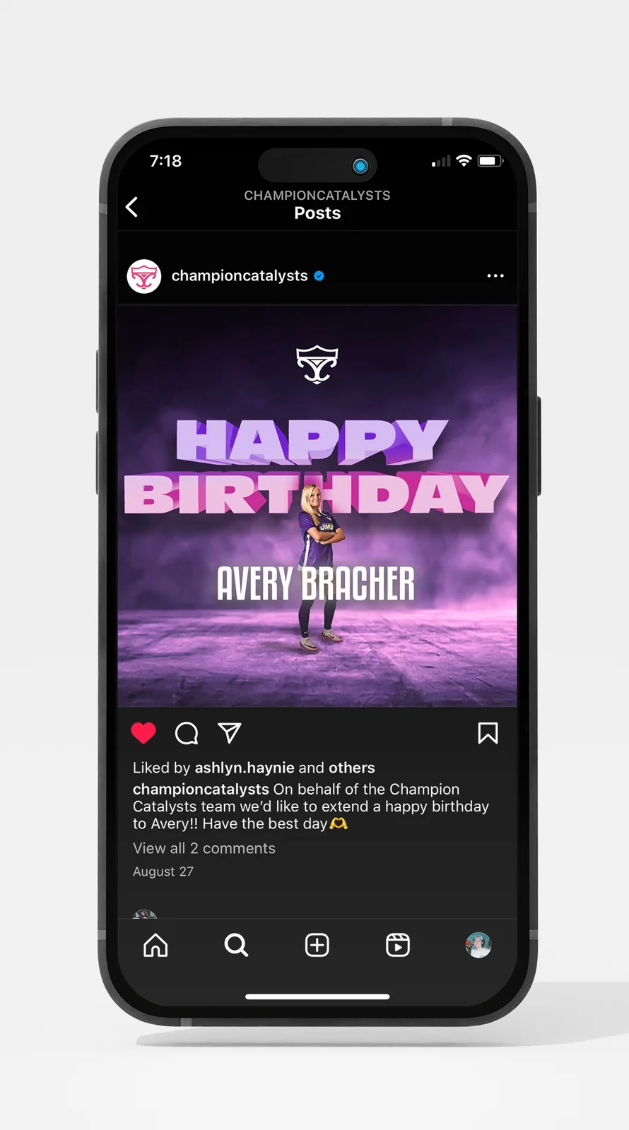 Birthday post
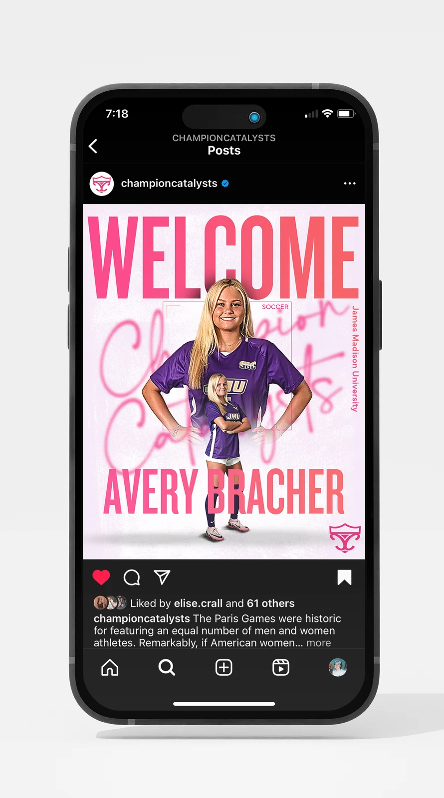 Welcome post
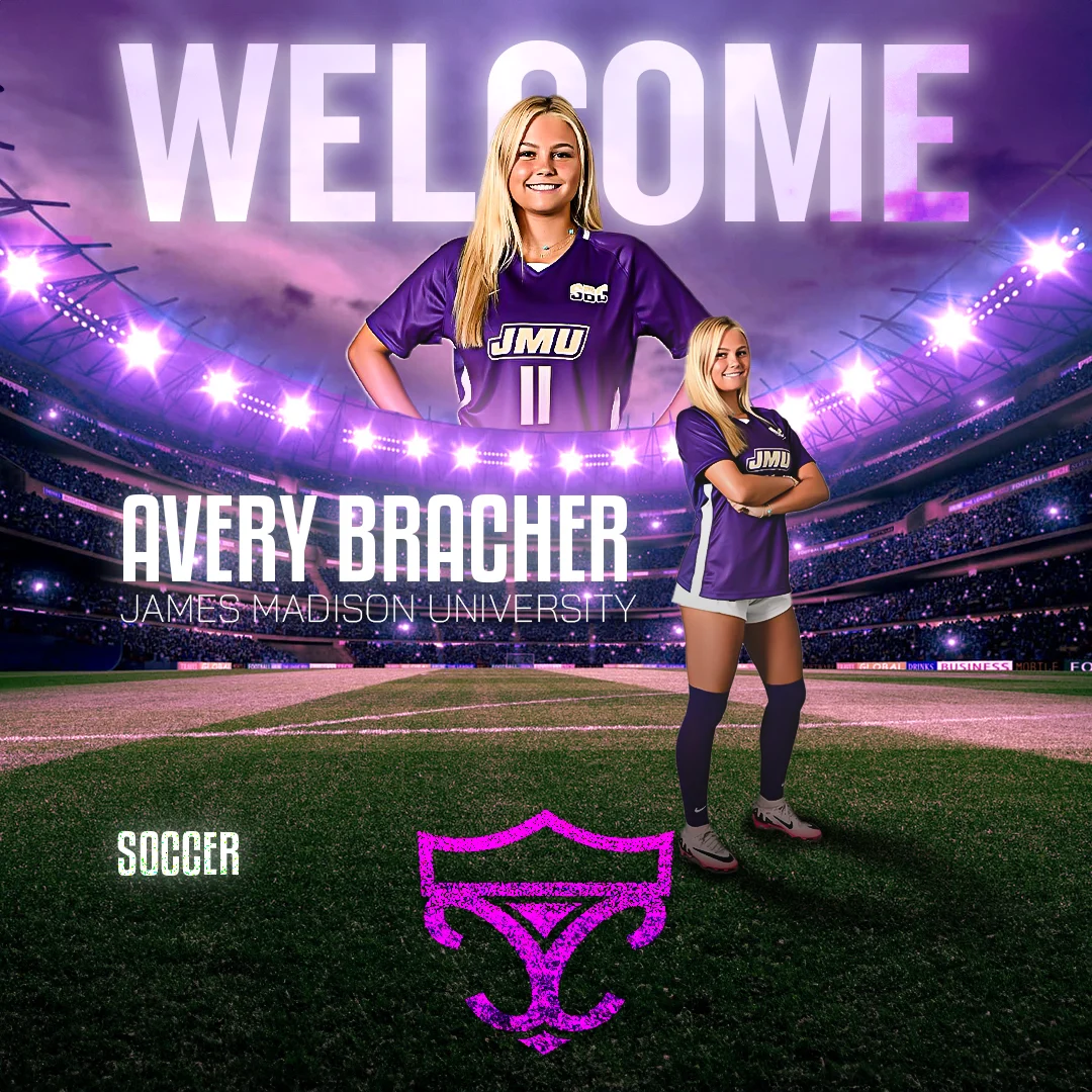 Client announcement
identity system now carrying every athlete announcement the agency posts
The logo had to do double duty: read as credible to athletes deciding who represents them, and feel like it belonged to them rather than a generic sports brand. The crest gave it institutional weight; the script and the fine line crown kept it from feeling borrowed from men's sports.
The project is ongoing, but the brand and post system are established, and every new signing now drops into a format that already looks like a professional, modern agency.